

The Returnolio score: one number for the whole analysis
One 0 - 100 headline per company, built from five pillars that are all on the page. What it weighs, how to read it, and what one number cannot tell you.
Last updated October 8, 2026
The Returnolio score is a 0 - 100 headline that compresses a full analysis into one number, so you can compare any two companies at a glance. It answers three questions at once:
- Is this a quality business?
- Is it priced below what it is worth?
- How wide is the downside if we are wrong?
Behind it sits a full reading of the business, up to four fair-value methods, and roughly a thousand companies re-scored every month against each other rather than against a fixed scale.


What the score weighs
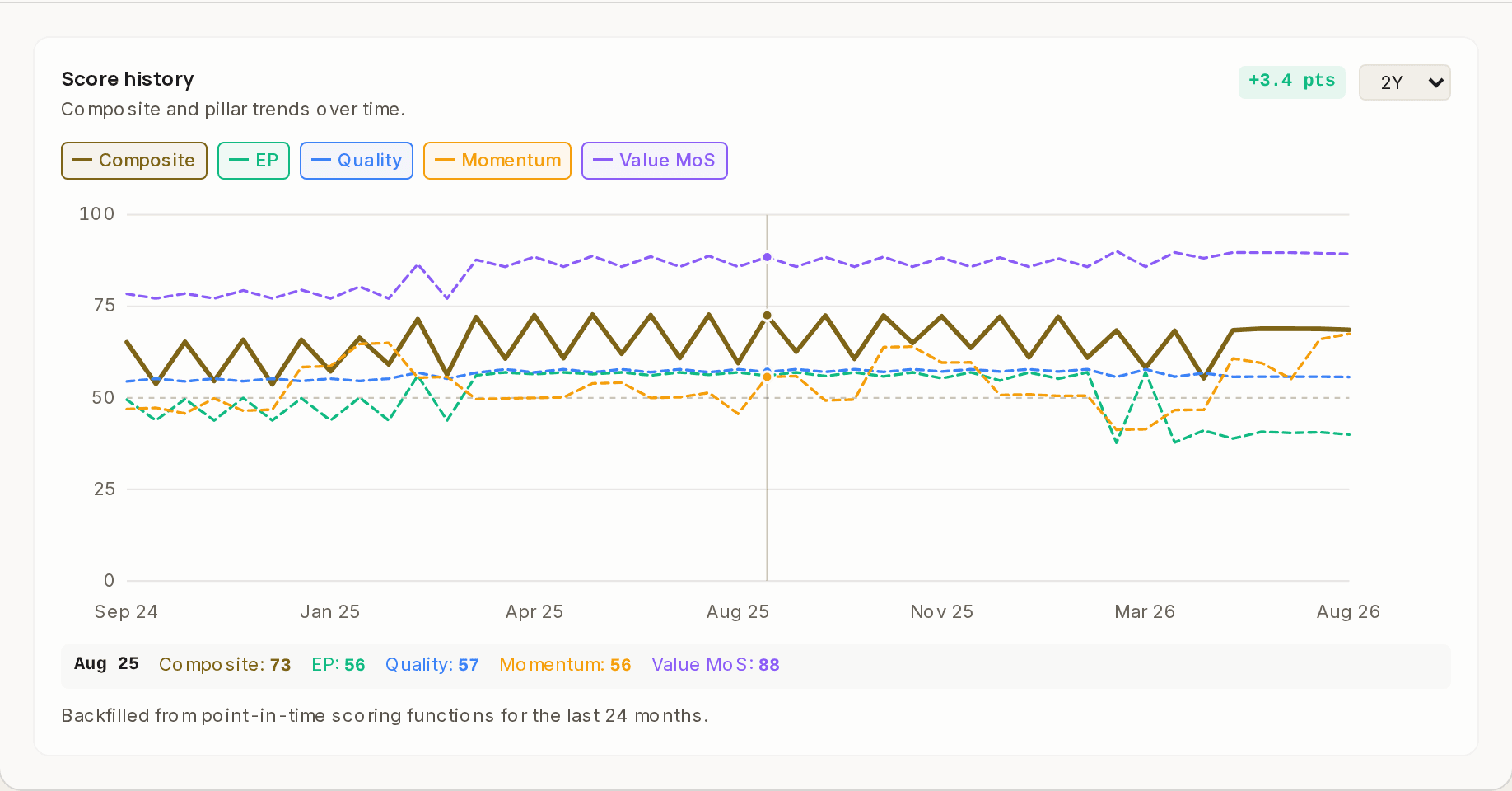
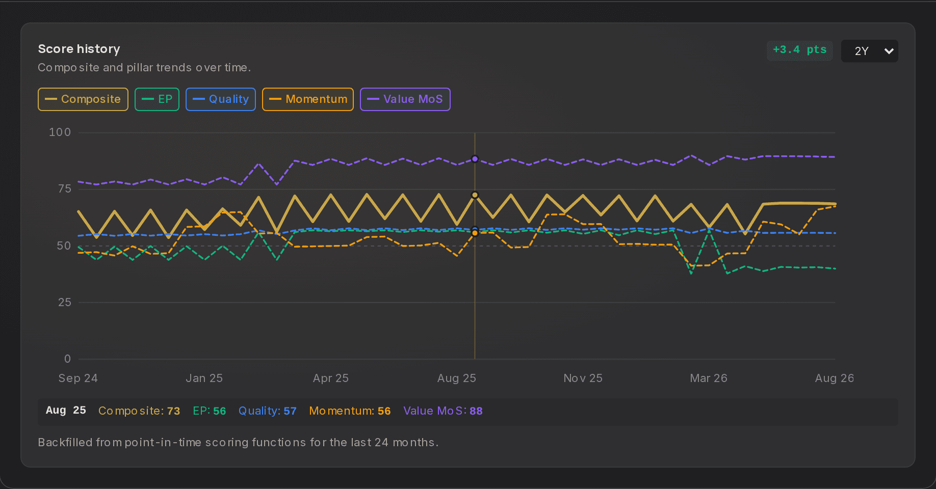
The score is built from the things that decide whether a business is worth owning and whether today's price is sane: how durable the business is, whether it earns more than its capital actually costs, how much room sits between the price and what we think it is worth, and what the market and the people closest to the company are doing about it.
The second is where our own measure comes in. A reported profit says nothing about what the capital behind it cost. RTEP, Returnolio True Economic Profit, charges every business for every dollar it uses and treats research as the investment it is. It has its own page: economic profit, and why accounting profit lies.
Each pillar opens up on the ticker page into the sub-metrics that produced it, each one ranked against the rest of the universe rather than scored on an absolute curve, so a single extreme metric cannot drag the ordering with it.
How they come together into one number is the part we keep to ourselves. The pillars are on the page. The sub-metrics are on the page. Every value is there to argue with. Which parts carry weight, how much, and how they combine is the thirteen years of work behind all of it, and it stays internal.
What one number cannot do
Compressing a business into a single figure costs something, and it is worth being blunt about what.
It travels badly between sectors. A regulated utility and a semiconductor designer are not playing the same game. The utility earns close to the return its regulator allows; the chip designer can earn many times its cost of capital in a good year and nothing in a bad one. Both are measured the same way, so the utility will almost always look worse than the software company, and most of that gap describes the two industries rather than the two management teams. Compare inside a sector first, and treat a cross-sector comparison as a question worth asking rather than an answer.
It is not the single truth about a company. The score is our reading, on the data we hold, on the day we ran it. Careful people disagree about businesses all the time. The score is one voice in that argument, not the referee.
It has exactly one job. A higher score means our model rates that company's chance of ending up ahead of the market average as better than a lower-scored one's. That is a ranking, not a forecast. It says nothing about what any one company will do over any particular period, and a high score has been wrong before and will be wrong again.
How to read it
Read the score as a sense of conviction, not a hard gate:
| Range | What it tends to mean |
|---|---|
| 80 - 100 | High conviction, the names we study hardest |
| 60 - 79 | Worth a deeper look |
| 40 - 59 | Mixed signals, usually one pillar dragging the rest |
| 0 - 39 | Likely a pass, unless you hold a strong contrarian view |
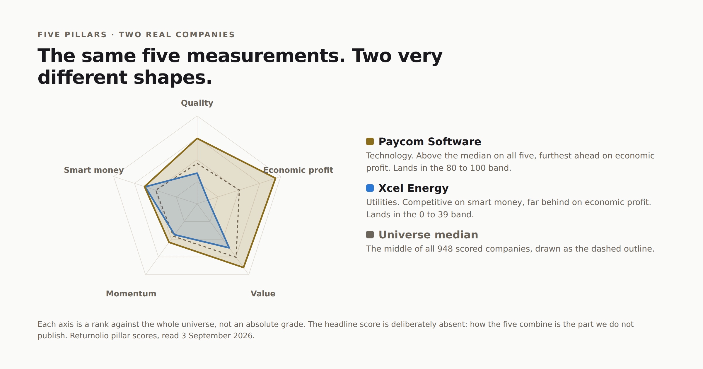
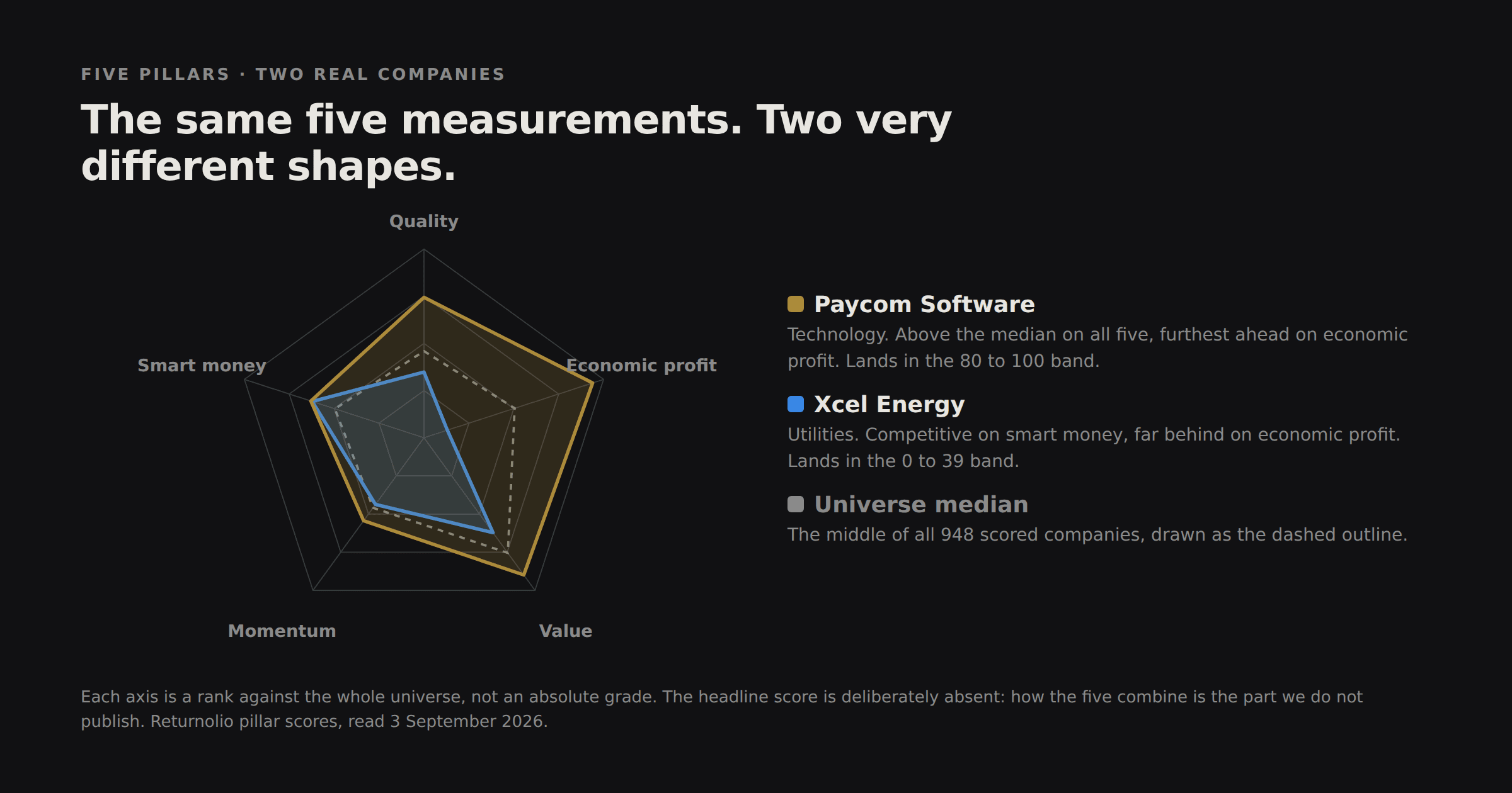
The shapes are the useful part. Paycom sits outside the median on every axis and lands in the top band. Xcel is competitive on smart money, close to the median on momentum, and a long way behind on economic profit, which is the shape of a business earning less than its capital costs.
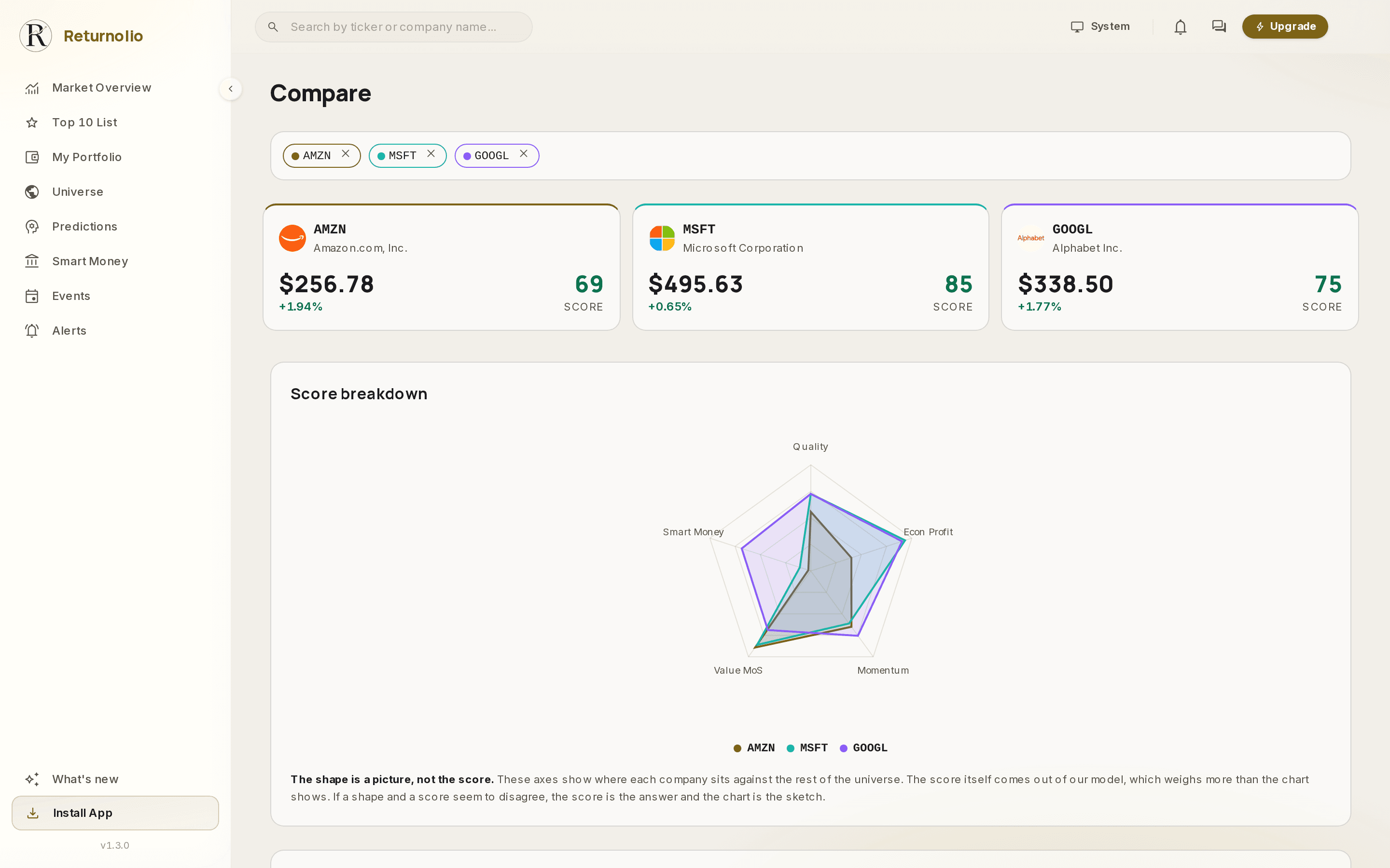
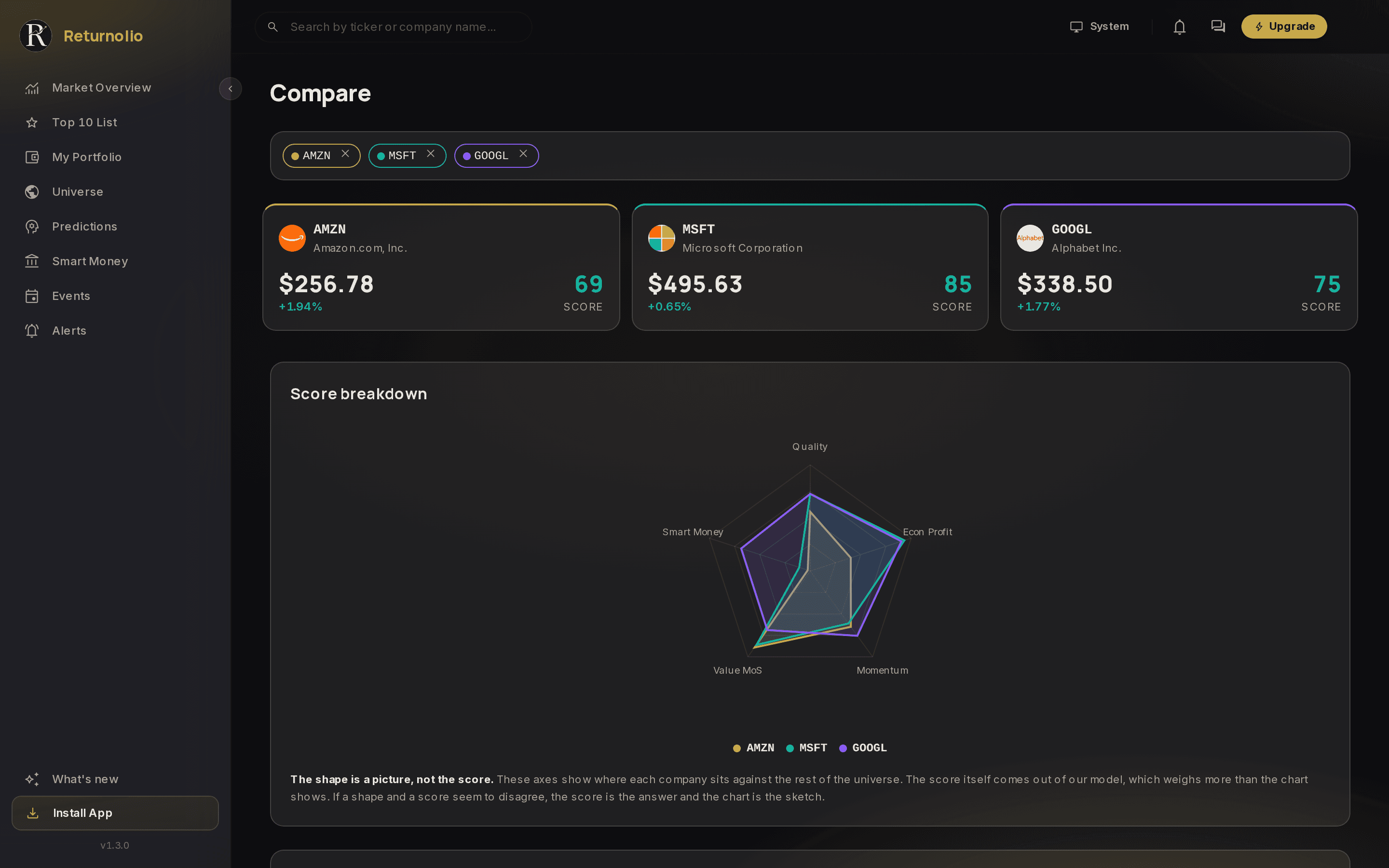
The shape is a picture, not the score. The chart plots how a few headline indicators sit against the rest of the universe, so you can see at a glance where a company is strong and where it is thin. It is a reading aid. The score itself comes out of our own model, which weighs more than the chart shows and weighs it in ways the chart does not display. A company can have an even shape and a middling score, or a lopsided shape and a high one. If the two ever seem to disagree, the score is the answer and the chart is the sketch.
A company with no track record is not a low score, it is no score. The Quality pillar needs enough annual filings behind it to measure anything, and until a company has them we withhold the headline rather than print a figure its history cannot carry. On 3 September 2026, 948 of the 973 companies in the universe carried a score and 25 did not, either because the filing history is too short or because we could not read a figure we need from the newest filing. An empty score is a deliberate withhold. It is never a zero, and it is never a judgement about the business.
What it doesn't do
The score is not a price target and not a recommendation. It is a starting point for your analysis, with the inputs visible so you can override any assumption you disagree with.
On the page
Every one of these is visible to you
- Every company's score, refreshed monthly
- The underlying measurements, with their values and dates
- The cost of capital used for the business, and the inputs behind it
- The R&D capitalisation and what it does to reported profitability
- Thirteen years of point-in-time results, including the years we lost
Kept internal
Named, so you know what you are not seeing
- Which parts of the analysis carry weight, and how they combine
- The rule that picks which fair-value method applies to which business
- The monthly re-ranking cut-off
- The thresholds inside each pillar
The work behind the number
- 13
- years tested, point-in-time
- 12,038
- filing dates pulled from EDGAR
- 973
- companies re-scored every month
- 0
- manual overrides in the test
The record behind the model is on the backtest page, losing years included.
Common questions
What does the Returnolio score measure?
It is one 0 - 100 reading of a whole analysis: how good the business is, whether it earns more than its capital costs, how far the price sits from what we think the company is worth, and what the market and insiders are doing about it. Every pillar behind it is on the company's page, with its measurements.
Is a high score a buy signal?
No. The score ranks companies against each other on the data we hold today. It is not a price target, not a forecast for any one company and not a recommendation. It is where your own analysis starts.
Why is the blend kept internal?
The pillars, the sub-metrics and every underlying value are published, so any reading can be checked and argued with. How they combine into one number is thirteen years of work and the one part that is not published.
Every pillar behind the Returnolio score is on the company's page, with the measurements under it. How they combine is the one part we keep.
Educational and proprietary. This explains what our research does, not the exact formula behind it, and it is not personalised investment advice. See the full disclaimer.
Was this page helpful?