

The ticker page: one company, one page
Everything we hold on a company as a single document you can read top to bottom, with shortcuts along the top instead of six tabs to click between. Every company gets the same page, and where we have nothing we say so rather than filling the gap with an estimate.
Last updated October 10, 2026
Everything we hold on a company lives on one page. Not a dashboard you assemble, not six tabs you click between. One document you can read top to bottom, with a row of shortcuts along the top that jump you to the section you want.
Every company in our 973-name universe gets the same page. Not every section has data for every name, and where we have nothing we say so instead of filling the gap with an estimate.
This page walks that document in order. Screenshots are from Amazon, which has data in every section.
The header
Before any section starts, the top of the page is a briefing.
Price sits on the right, tagged Delayed, next to a live open/closed indicator for the US market. Beside the ticker you get the exchange, a country flag, an ADR badge where one applies (an ADR is a foreign company's shares packaged to trade on a US exchange), and buttons to follow the company, add it to a watchlist or portfolio, or send it straight to the compare tool.
Under that, five headline numbers: market cap, the Returnolio score, P/E, smart money and dividend yield.
Then two rows of metrics that most pages make you dig for:
- Value metrics. RTEP margin, ROIC (return on invested capital, what the business earns on the money it uses), free-cash-flow yield, P/E, the Piotroski score (a nine-point checklist of basic financial health) and shareholder yield.
- Growth metrics. Revenue growth, gross margin, net margin, R&D as a share of revenue, P/S and net debt to EBITDA.
Each one carries a small range bar showing where today's reading sits inside the company's own history, with the industry median marked as a reference. ROIC also marks the cost of capital, what the money the business runs on actually costs it, so you can see at a glance whether the business clears its own hurdle. A Value/Growth toggle dims whichever row matters less for the kind of business you are looking at.
Below the header sits a full interactive price chart, and a collapsible description of what the company actually does.
Summary
The page opens with a written summary: headline, score breakdown, valuation, strengths, risks, what to watch next, and a pointer to the sections worth your time on this particular company. It is generated, it is timestamped, and it is described in detail on the AI summaries page.
Score


The headline is a rank, from 0 to 100, with a plain-word label attached. Pillars are percentile-ranked across the universe one at a time, so a single outlier metric cannot dominate the ordering.
Every pillar is shown, at the same size, with the value each one produced. Hiding a signal we look at would be the wrong kind of tidy, so nothing that goes into the analysis is kept off the page.
Score breakdown
The headline score is a rank. This section is where it gets taken apart.
Every pillar opens up: the question it answers, the inputs behind it, and the sub-metric values that produced the number. How they blend into one headline is the one part we keep to ourselves.
Management
Executive pay, broken into salary, stock and options, bonus and incentive, and everything else, plotted against a benchmark for comparable companies. Worth a look when a business is generating cash and you want to know who it is going to.
Valuation
Several methods, shown side by side, rather than one number presented as truth. Where they disagree, that disagreement is the useful part.


The fair-value methods themselves, and how a business gets routed to one, are covered on the fair-value methods page.
Company guidance
What the company itself promised, and whether it delivered.
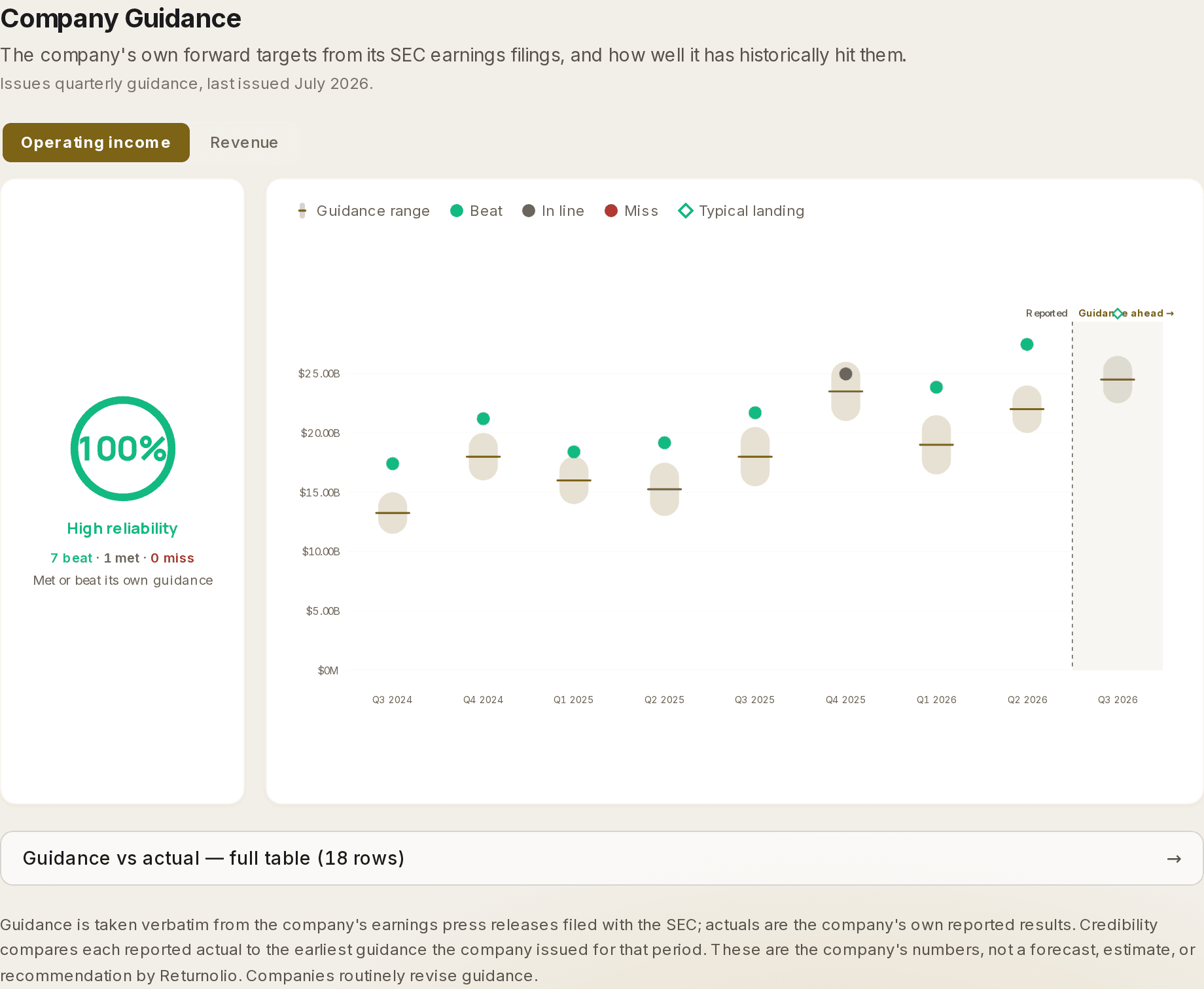
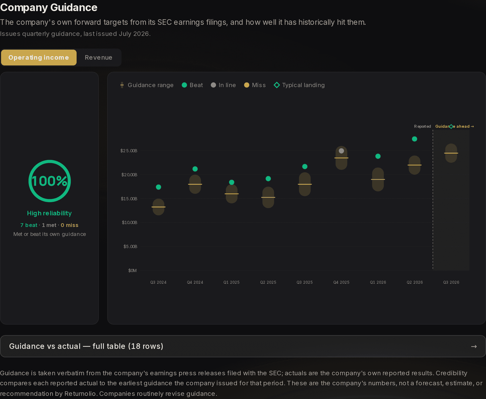
Guidance is taken from the company's own earnings releases and earnings calls, and actuals are the company's own reported results. Nothing here is our forecast. It is a track record of how seriously to take the next promise. Company guidance has its own page: how a period is scored, what the typical landing means, and what the section says when a company publishes no targets.
Earnings calls
The call itself, when the company publishes one openly.
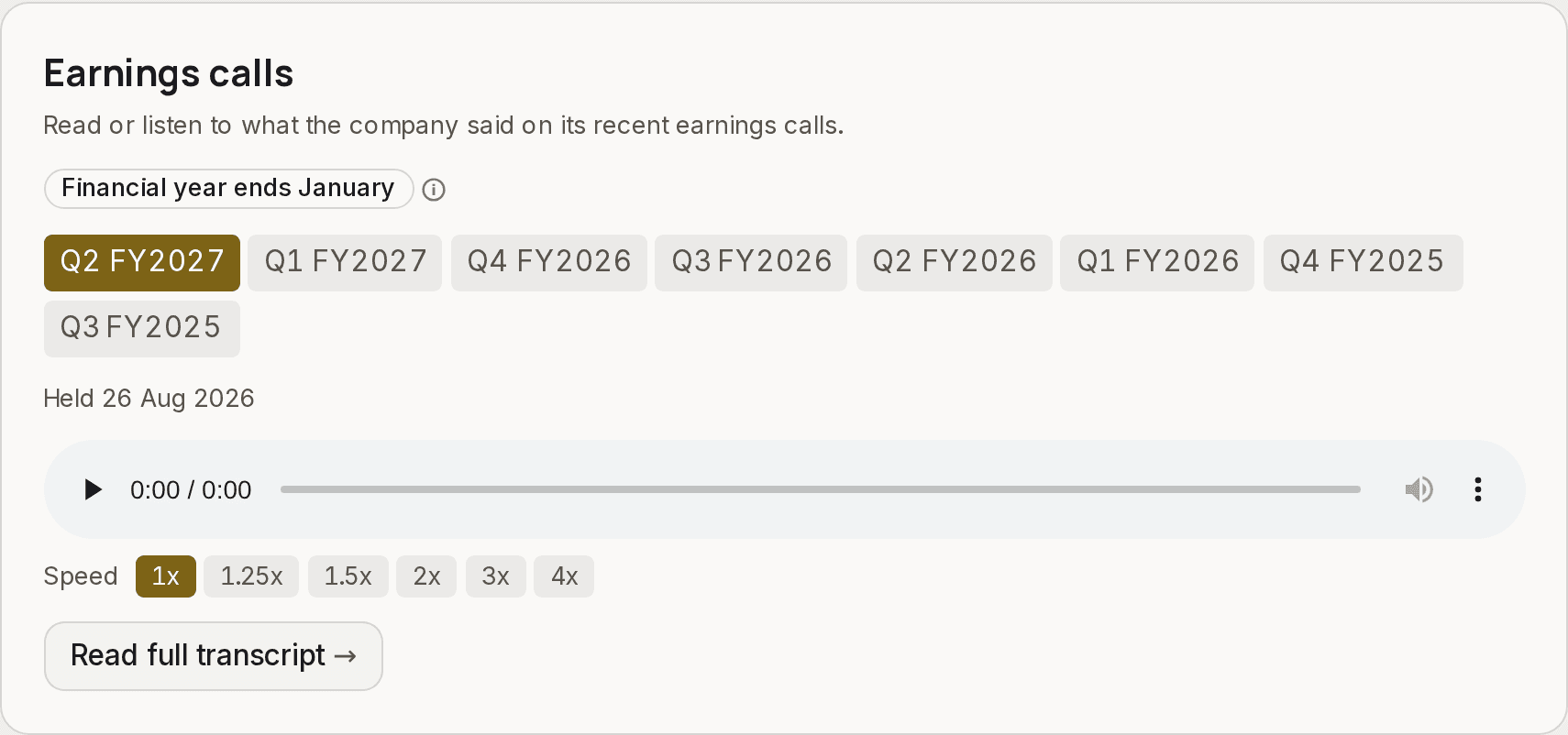
Each call is named the way the company names it, the same as in its filings and on the call itself. When a company's financial year does not end in December, a Financial year ends badge above the calls says which month it does, so NVIDIA's "Q2 FY2027" in August 2026 reads as its own year, not the calendar's. Under the calls is the date each one was held.
Transcripts are our own machine transcription of a public broadcast, and every one of them says so underneath, along with the model that produced it and a link to the source. Some companies only offer registration-gated webcasts. Those we leave alone, so a few tickers show an empty state here rather than a paywalled link.
The financial statements
Three sections, same shape, annual or quarterly: income statement, balance sheet and cash flow. Sourced from filings, not retyped.
Between them sits Growth and margins, which is the one people actually read: revenue, gross profit and margin, operating income and margin, net income and margin, and diluted EPS, each with the year-on-year change beside it. Where analyst estimates exist for a future year, that column is labelled as an estimate rather than quietly blended in with reported history.
Revenue segments
Where the money actually comes from. Useful the moment a company is more than one business wearing a single ticker.
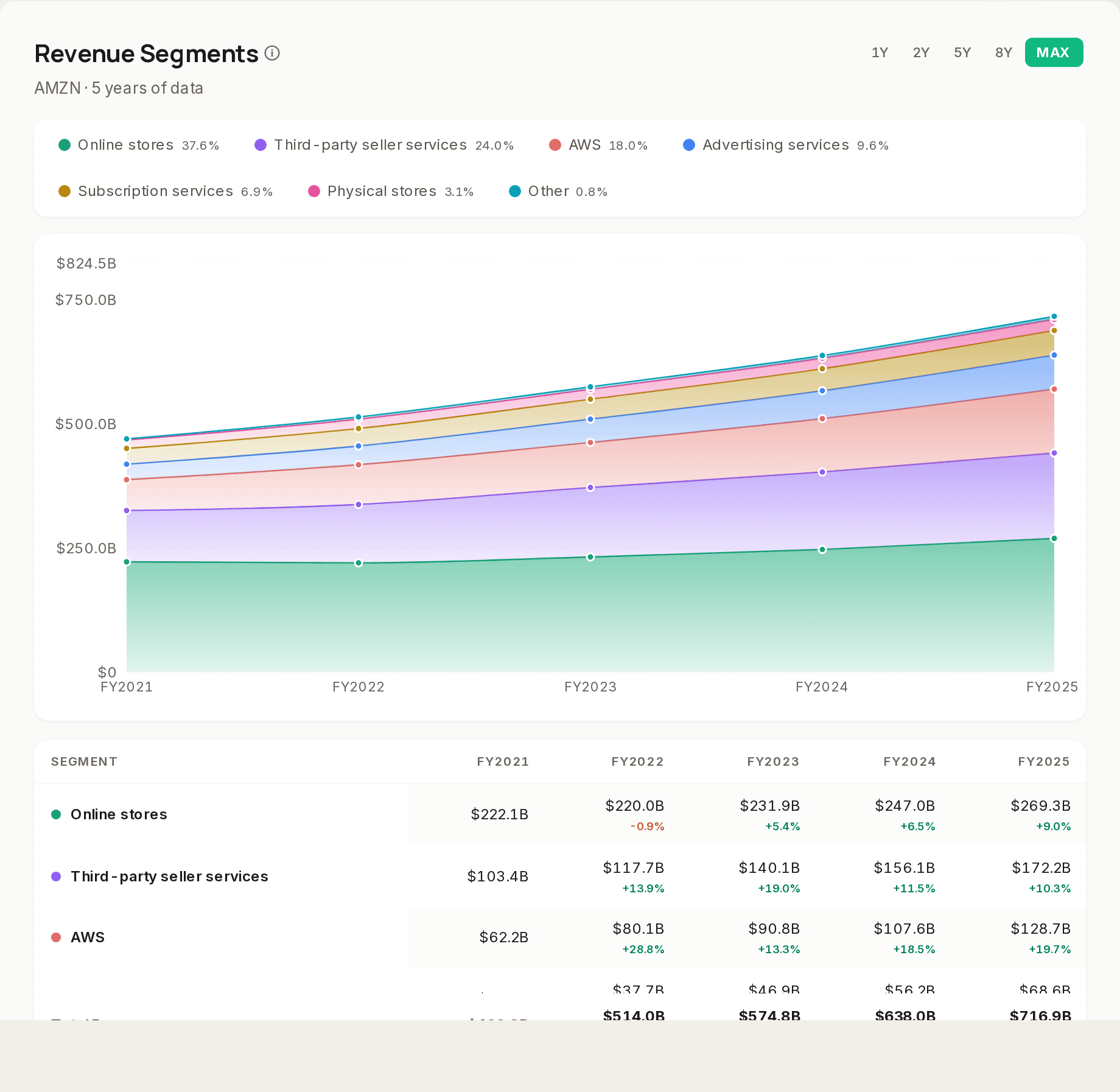
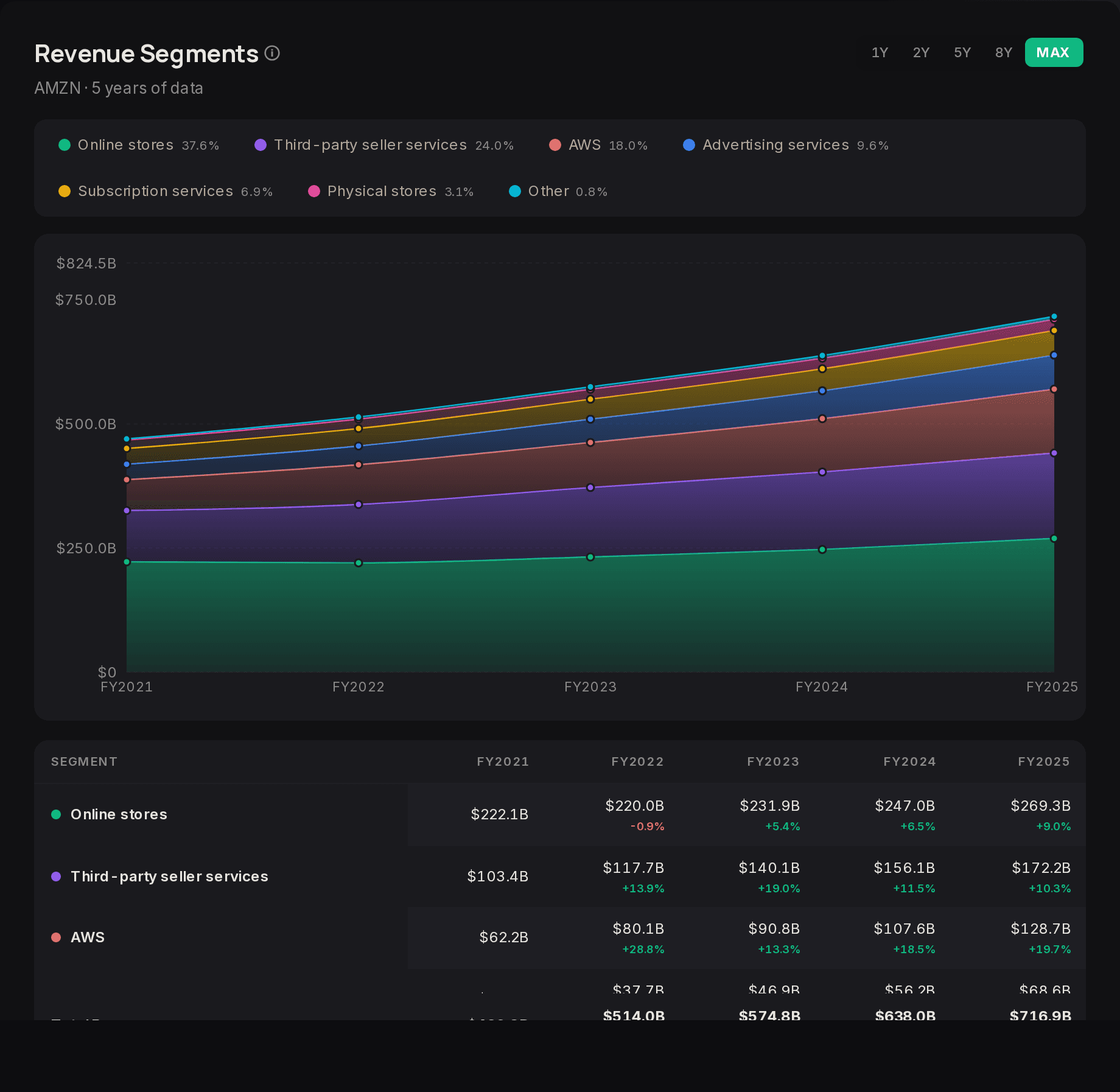
Geography is the same question asked a different way, as a world map of revenue by region with the numbers in a table underneath.
Smart money and famous holders
Two panels. The first tracks buying and selling by company insiders and by US politicians, filterable by side, with the person, the value and the date. The second lists well-known investors holding the stock from the latest 13F filings, tagged as new, added, held, trimmed or closed.
Both feed the Smart Money pillar. The smart money page goes further into what these filings can and cannot tell you.
Predictions
Prediction-market odds relevant to the company, where a market exists. Often there is nothing, which is the honest answer rather than an empty chart.
Compare anything
A metric picker covering income, growth, balance sheet, cash flow and profitability, including ROIC, WACC (a company's average cost of capital) and RTEP margin, charted for this company against others you choose. It is the compare tool without leaving the page.
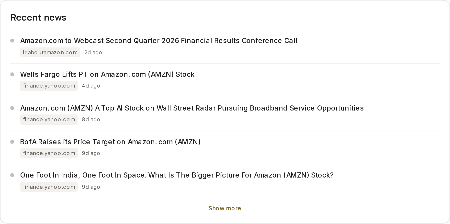
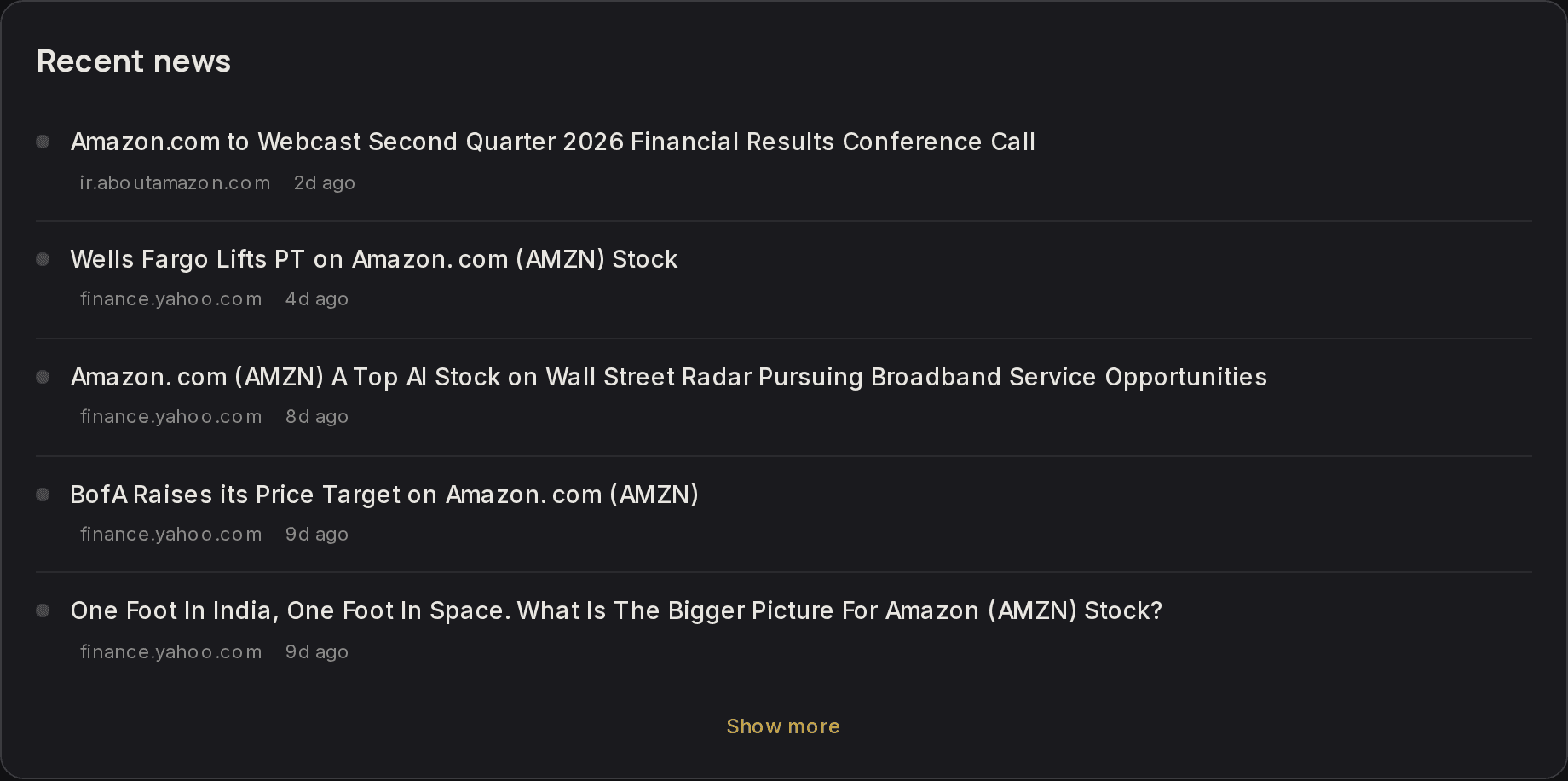
News
A faster way in
The tab row along the top scrolls you to a section instead of loading a new page. Nothing is hidden behind it, so if you prefer to read the whole company in one pass, just scroll.
Educational and proprietary. This explains what our research does, not the exact formula behind it, and it is not personalised investment advice. See the full disclaimer.
Was this page helpful?