

Market overview: what kind of day it is
A written briefing on the current market, a map of the conflicts, storms and energy disruptions moving supply chains, and the macro backdrop underneath. It answers what kind of day it is before you go looking for individual companies.
Last updated July 19, 2026
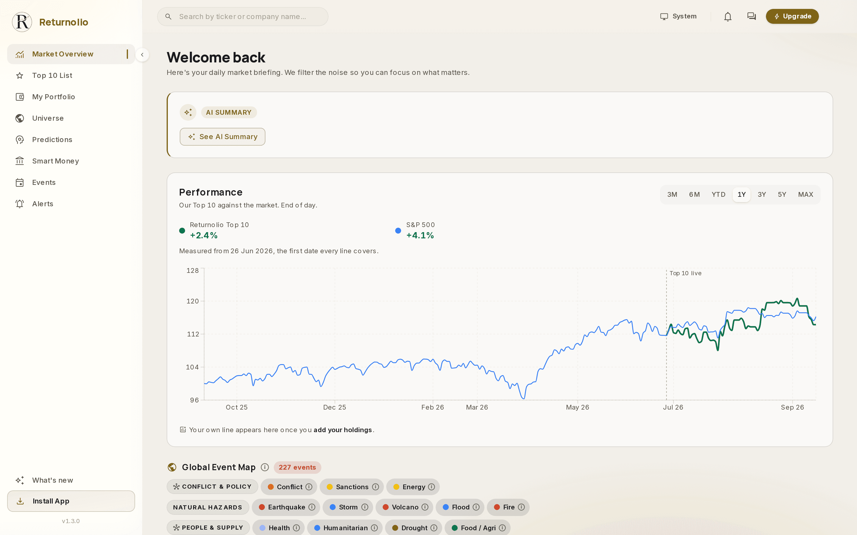
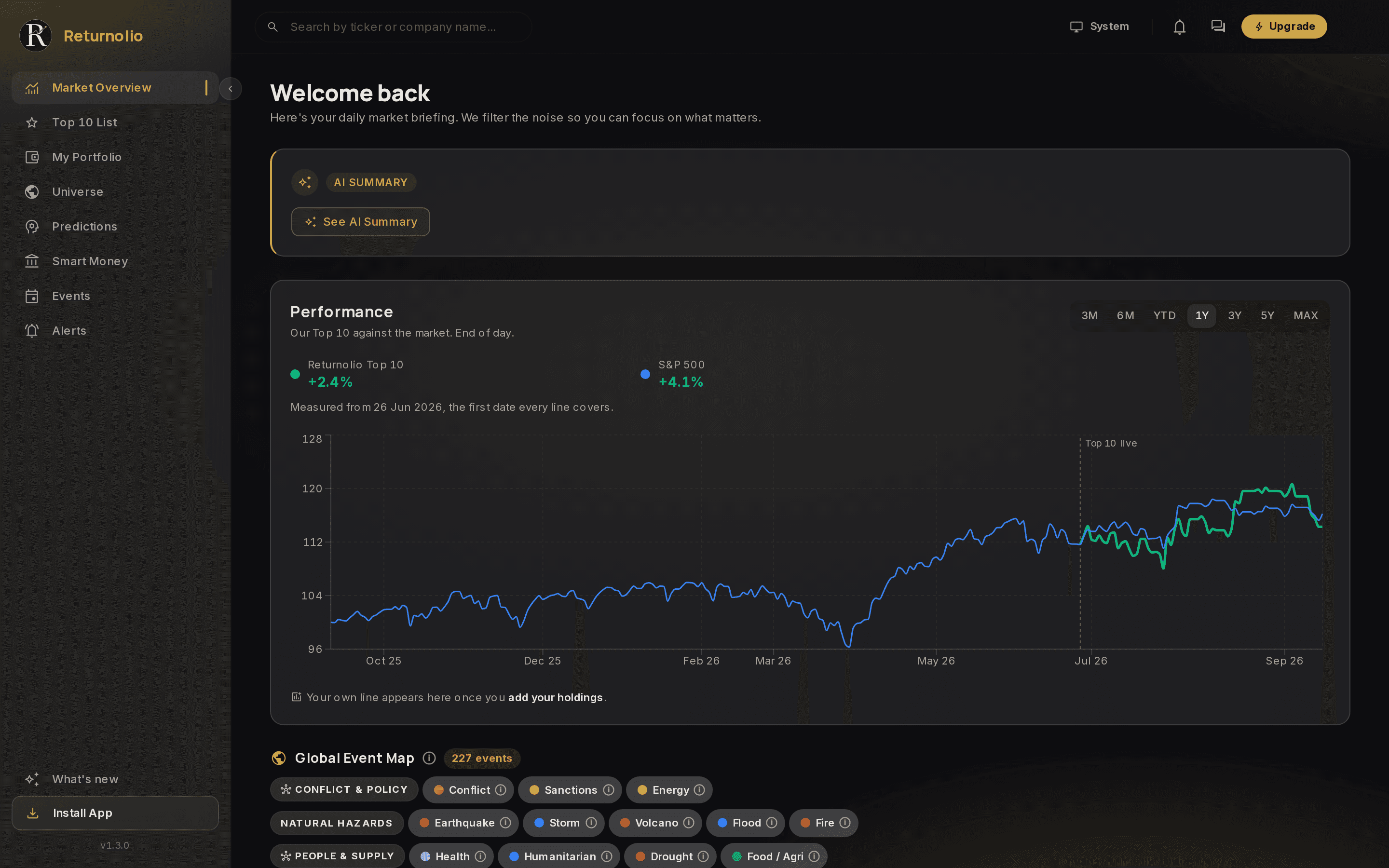
The landing screen answers one question before you go looking for companies: what kind of day is it. A written briefing, the Top 10 against the market, a map of what is happening in the world, and the macro backdrop, in that order.
The briefing
The card at the top writes a short read on the current market, generated from the same data the rest of the app runs on. It carries the time it was written. See AI summaries for what that machinery is and is not allowed to do.
The event map
Conflicts, sanctions, storms, energy disruptions and health events, plotted where they happened and filterable by type.
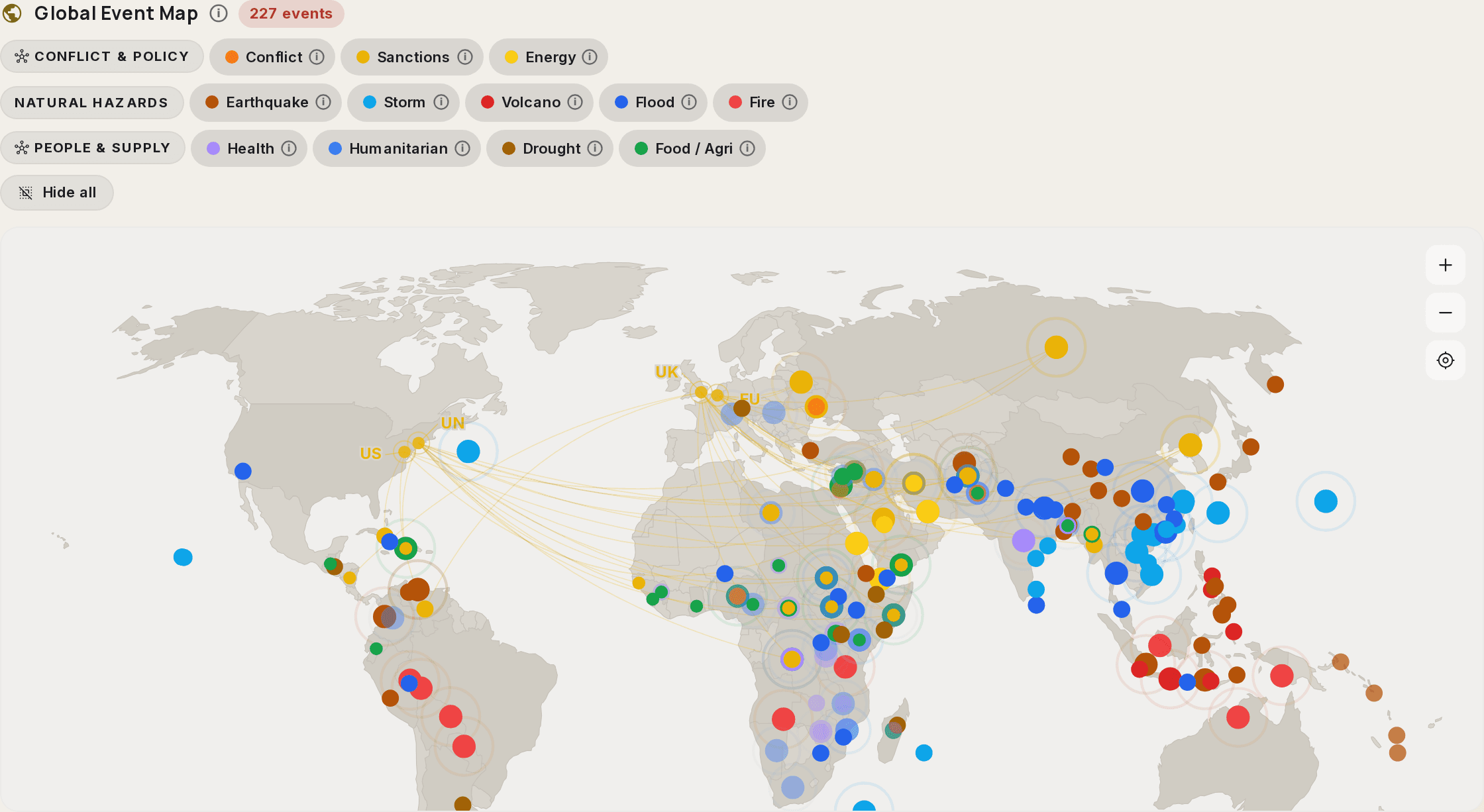
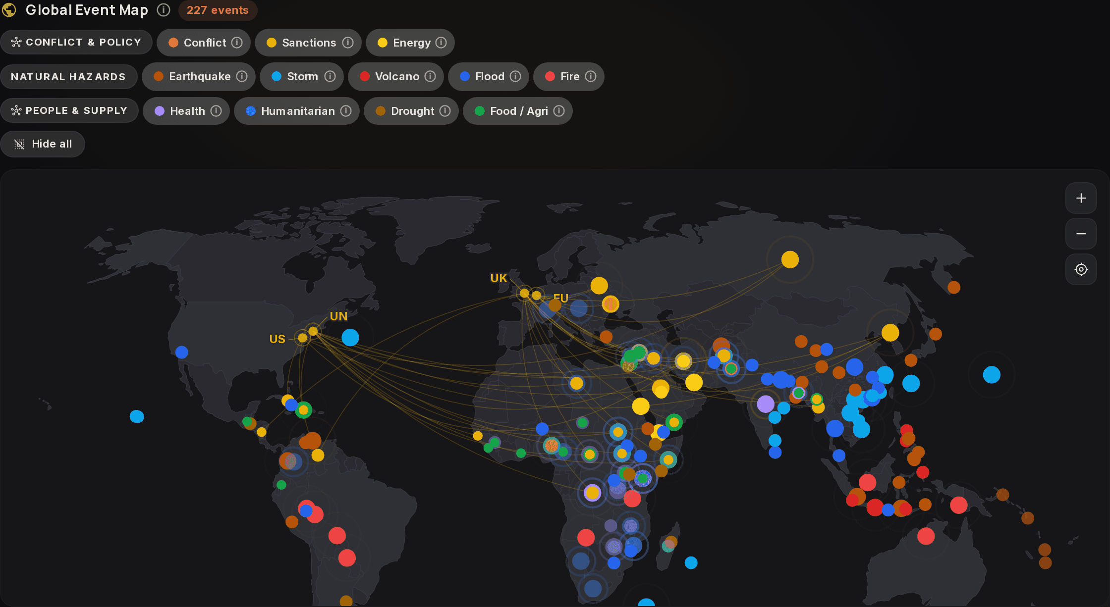
The reason a stock research tool ships a world map is that the things which break a thesis (your reason for owning a stock) often start somewhere physical. A drought, a shipping disruption, a sanctions package. None of it shows up in a filing until the quarter after it mattered.
Context, not a signal
The map is background. It does not score events, rank them by market impact, or connect them to specific companies for you. It tells you what is happening so that you notice when something touches an industry you hold.
Macro snapshot
Underneath, the macro numbers: rates, the yield curve (the gap between what short-term and long-term government borrowing pays), inflation, and the indicators that set the backdrop everything else is priced against. Same idea as the map, in numbers rather than geography.
The same backdrop informs the Top 10, where judging whether the macro picture is hostile to a thesis is part of the human selection step rather than something a filter does.
Educational and proprietary. This explains what our research does, not the exact formula behind it, and it is not personalised investment advice. See the full disclaimer.
Was this page helpful?