

How to compare stocks side by side
Put several companies on the same axes so the differences do the talking. The radar shows when two names with nearly identical headline scores got there in completely different ways, one cheap and mediocre, the other excellent and expensive.
Last updated July 19, 2026
Reading one company well tells you what it is. Reading three against each other tells you how they differ, which is usually the harder question. Compare puts several names on the same axes so the differences do the talking.
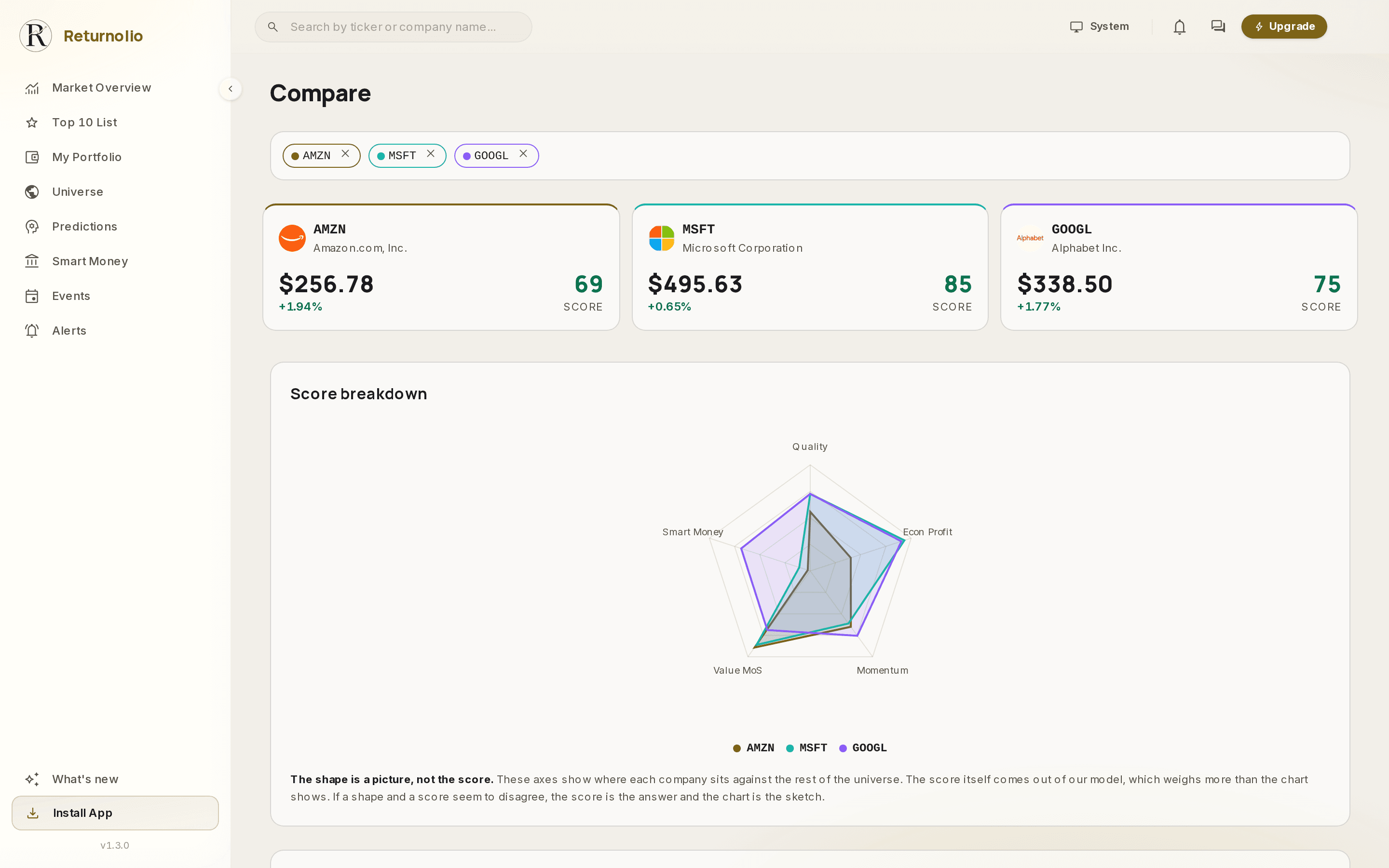
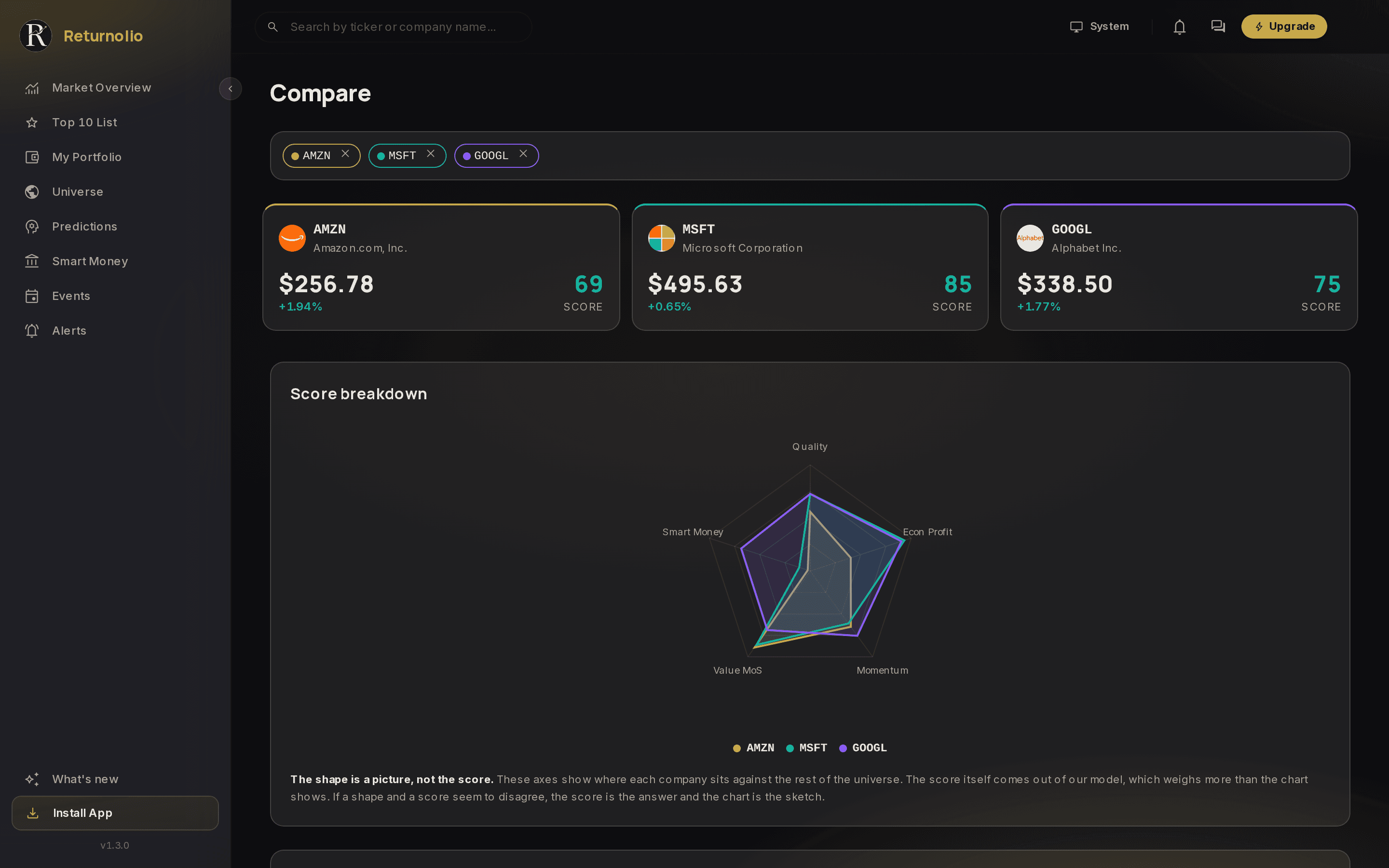
The radar
One shape per company. It is the fastest way to see that two names with nearly identical headline scores got there completely differently: one cheap and mediocre, the other excellent and expensive.
Every pillar (each of the broad angles the score looks at) is on the chart, at the same size, so nothing you looked at is hidden from the comparison. A company can win on most axes and lose the argument on the one that matters for it, and the shape shows you that faster than any table.
The shape is a picture, not the score. The chart plots how a few headline indicators sit against the rest of the universe, so you can see at a glance where a company is strong and where it is thin. It is a reading aid. The score itself comes out of our own model, which weighs more than the chart shows and weighs it in ways the chart does not display. A company can have an even shape and a middling score, or a lopsided shape and a high one. If the two ever seem to disagree, the score is the answer and the chart is the sketch.
The scorecard
Below the radar, the same companies line up row by row on the underlying metrics: profitability, growth, valuation multiples, balance sheet. Where the radar gives you the shape, the scorecard gives you the number that produced it.
Compare like with like
The tool will happily put a bank next to a software company, and the comparison will be meaningless. Valuation multiples in particular (P/E and its cousins) do not travel between industries. Compare works best on names that could plausibly compete for the same slot in your portfolio.
Financial charts
The bottom section gives each selected company its own set of charts over the same period: revenue with operating margin (how much of each sale survives as profit from running the business), assets against liabilities, and free cash flow (the cash the business actually throws off, as opposed to the profit it reports) against capital spending. Reading them side by side shows trajectory, which is usually more informative than a snapshot. A company improving from a weak base and one sliding from a strong one can meet in the middle on any single day.
Getting there
Compare is a paid feature, and how many companies you can line up at once depends on your plan. See what each plan gets you.
You can open Compare directly and search for names, or arrive from a company page with that ticker already loaded. Selections live in the address bar, so a comparison you find useful is a link you can keep.
Educational and proprietary. This explains what our research does, not the exact formula behind it, and it is not personalised investment advice. See the full disclaimer.
Was this page helpful?